
Challenge
Verve had evolved into a broader ecosystem, but its website no longer reflected how its products connected.
Poor information architecture, unclear navigation, and weak content hierarchy made important information difficult to find.
The experience made it harder for users to understand Verve’s products and the value of the wider ecosystem.
Approach
I conducted a UX audit and benchmarked leading digital products to identify opportunities across structure, navigation, content, and visual hierarchy.
I explored multiple navigation directions and worked through tradeoffs with stakeholders to arrive at the strongest direction.
I restructured the experience around Verve's growing ecosystem, creating clearer paths into VerveWorld, Cards, Mobile, and other key offerings.
Outcome
The redesigned website became a clearer entry point into the Verve ecosystem, helping visitors understand what Verve offers and where to go next.
Product discovery became more structured, with clearer hierarchy and pathways between related offerings.
The new foundation supports a more connected Verve experience as the ecosystem continues to evolve.
As Verve's ecosystem expanded, the website no longer reflected how its products connected or the experience the brand had grown into. Instead of helping users understand the ecosystem, it made discovery and navigation unnecessarily difficult.
I analyzed user interactions and benchmarked Verve against top industry platforms. This revealed key patterns where users struggled to navigate, discover products, and understand the ecosystem, highlighting where the experience broke down.
These recurring patterns emerged as the most critical friction points in the user journey.
As the lead product designer, I drove the project from research to execution, defining the design direction through early concepts and frequent iteration.
The business vision was clear:
Reposition Verve as a lifestyle companion, introduce VerveWorld as the entry point, and better showcase its core offerings.
With the business vision established, I explored different navigation models to find the right balance between product discoverability and a clear information hierarchy. Each concept was reviewed with stakeholders, helping uncover the trade-offs that ultimately shaped the final direction.
Consolidating navigation into a single component made products accessible, but blurred the distinction between the main site navigation and product-specific navigation. During design reviews, it became clear that while discoverability improved, the lack of hierarchy created confusion around how users should navigate the site.
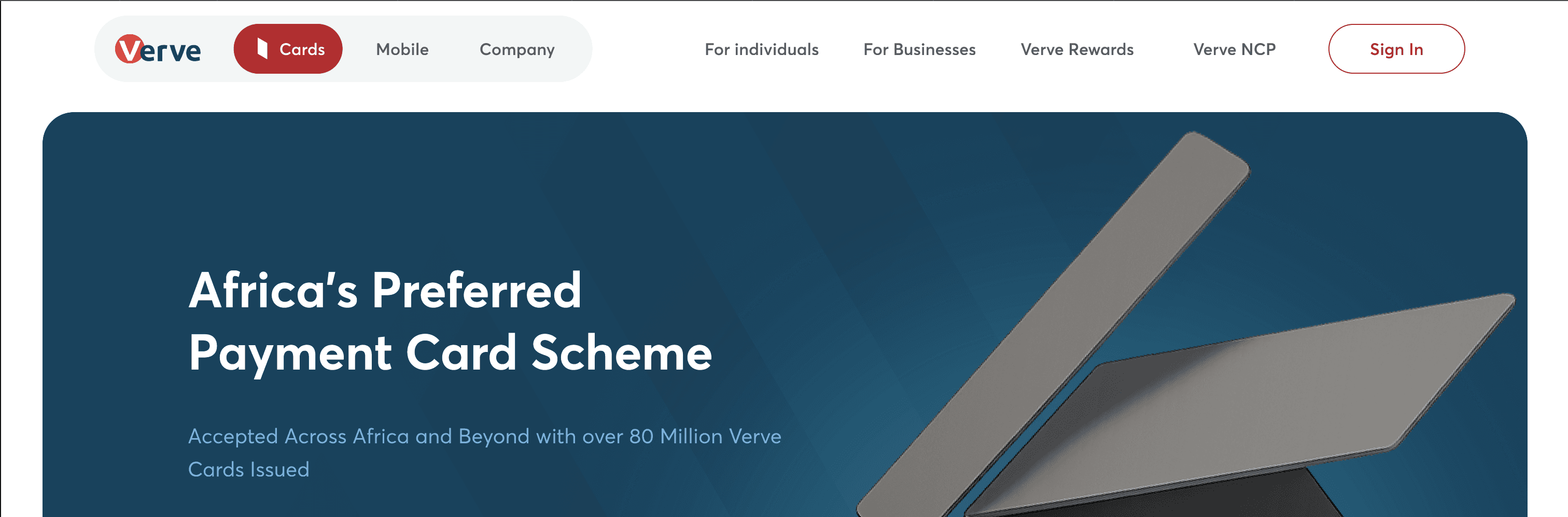
Separating the navigation reduced visual clutter, but relying on hover made product access less obvious and introduced an additional interaction. Stakeholder feedback reinforced that the interaction wasn't discoverable enough, particularly for users who needed quick access to Verve's products.
Keeping product navigation consistently visible gave users immediate access to Verve's core offerings while maintaining a clear distinction between the main site navigation and product-specific navigation
Finding the right navigation wasn't straightforward. Each concept solved one problem while exposing another, leading to several rounds of discussion with stakeholders. The final direction was chosen because it best balanced product discoverability with a clear navigation hierarchy while supporting Verve's vision of presenting its products as one connected ecosystem.
Beyond navigation, the same thinking influenced how Verve was presented throughout the experience. Early concepts highlighted individual moments, but through iteration these evolved into a more immersive narrative that positioned Verve as a lifestyle companion rather than a collection of products.


The chosen direction became the foundation for every major touchpoint. From product pages to initiatives and account journeys, a consistent structure and visual language created a connected experience while reinforcing Verve as a single ecosystem.

Each experience was designed to help users understand how Verve's products fit together, while giving the business a clearer way to communicate the breadth of its offerings.


Every decision was grounded in helping users better understand Verve's growing ecosystem while supporting the company's evolving vision. This project reinforced that as businesses evolve, their digital experiences should evolve with them—ensuring the experience continues to reflect the business it represents.
Next Project >>