

Challenge
A 20-year-old core banking platform had become difficult to navigate and learn, creating friction in everyday banking tasks.
The experience needed to evolve without losing the workflows banks already relied on.
The redesign also had to bring greater consistency across a complex platform with many different banking workflows.
Approach
I helped drive the redesign from discovery to delivery, taking ownership of the design direction as the project evolved.
I focused on making everyday banking tasks easier to navigate and complete, using efficiency, clarity, and consistency to shape key design decisions.
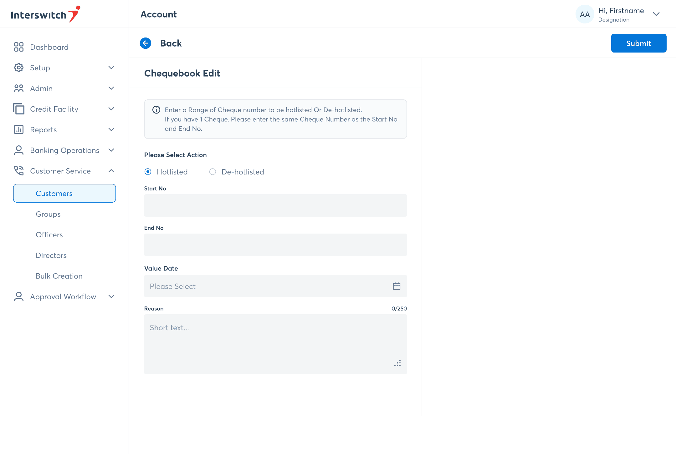
That thinking carried across the platform—from dashboards and reports to forms and workflows—creating a more consistent experience across the product.
03 Outcome
The redesigned platform has supported the onboarding of 14 banks, extending its use across multiple financial institutions.
The platform was deployed to a bank in Uganda, expanding its reach beyond Nigeria into East Africa.
The redesign brought greater cohesion across the platform's core experiences, providing a stronger foundation for its continued evolution.
For over two decades, this core banking platform supported financial institutions in managing critical banking operations. As new features and workflows were introduced over time, the platform became increasingly fragmented, making routine banking tasks less efficient.

Managing day-to-day banking operations should be seamless, yet many routine workflows were slowed down by unnecessary complexity. Four recurring issues contributed to this experience.
Information was hard to find
Key modules and reports were buried within multiple layers, making them difficult to find when needed.
Routine tasks took more steps than necessary
Simple tasks like searching, filtering, and selecting dates required unnecessary steps and navigation.
The platform was difficult to learn
The platform's complexity increased onboarding time for new users.
I helped drive the redesign, focusing on simplifying key banking workflows while preserving the platform’s core functionality.
The objective was clear: modernize the experience without disrupting the workflows banks already relied on. Every design decision was guided by three principles that shaped the redesign.
Design for Efficiency
Everyday tasks were stripped back to their essentials, reducing unnecessary steps so users could complete common actions faster.
Design for Clarity
Related information and actions were brought together, making the platform easier to scan, understand, and navigate.
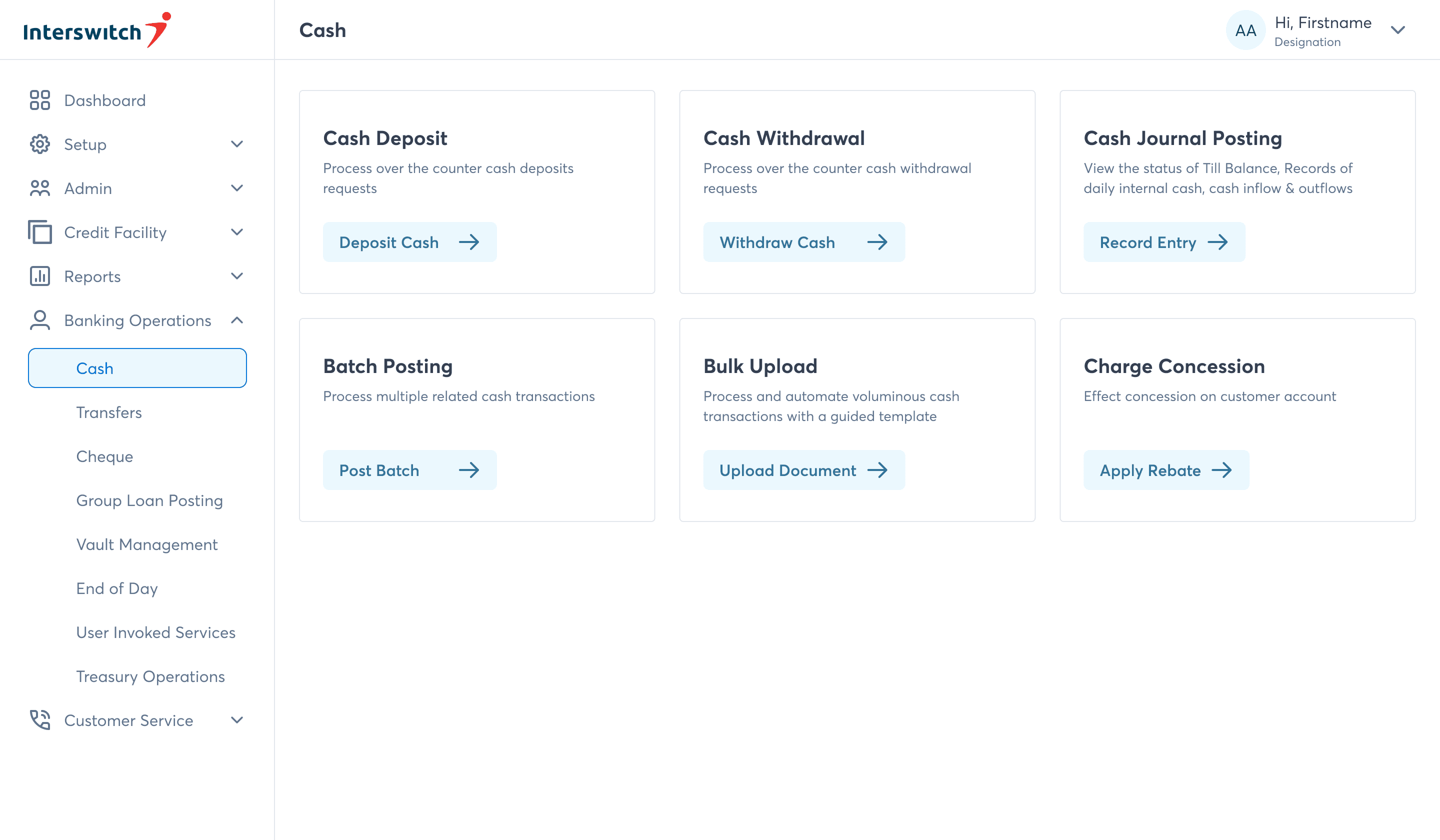


Design for Scale
Reusable layouts, navigation patterns, and components created a shared framework that made the platform easier to expand while keeping the experience familiar across modules.
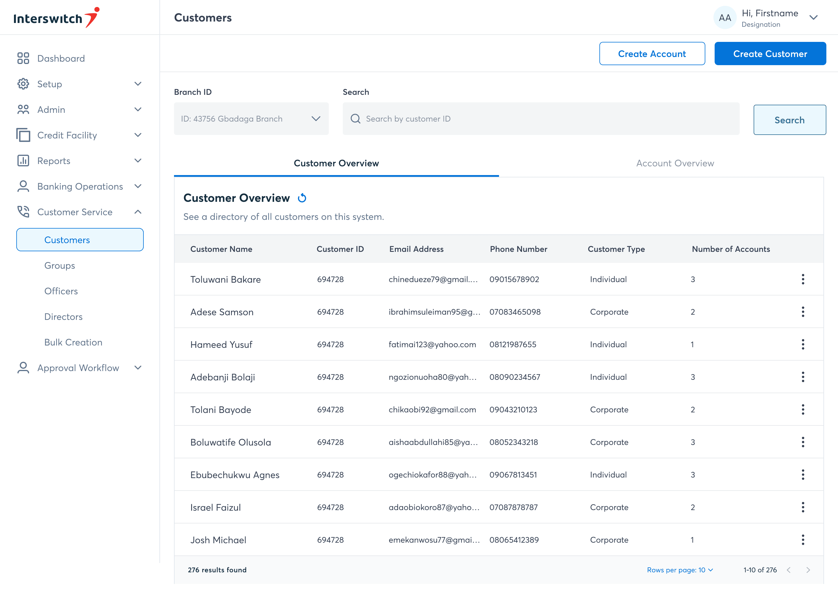

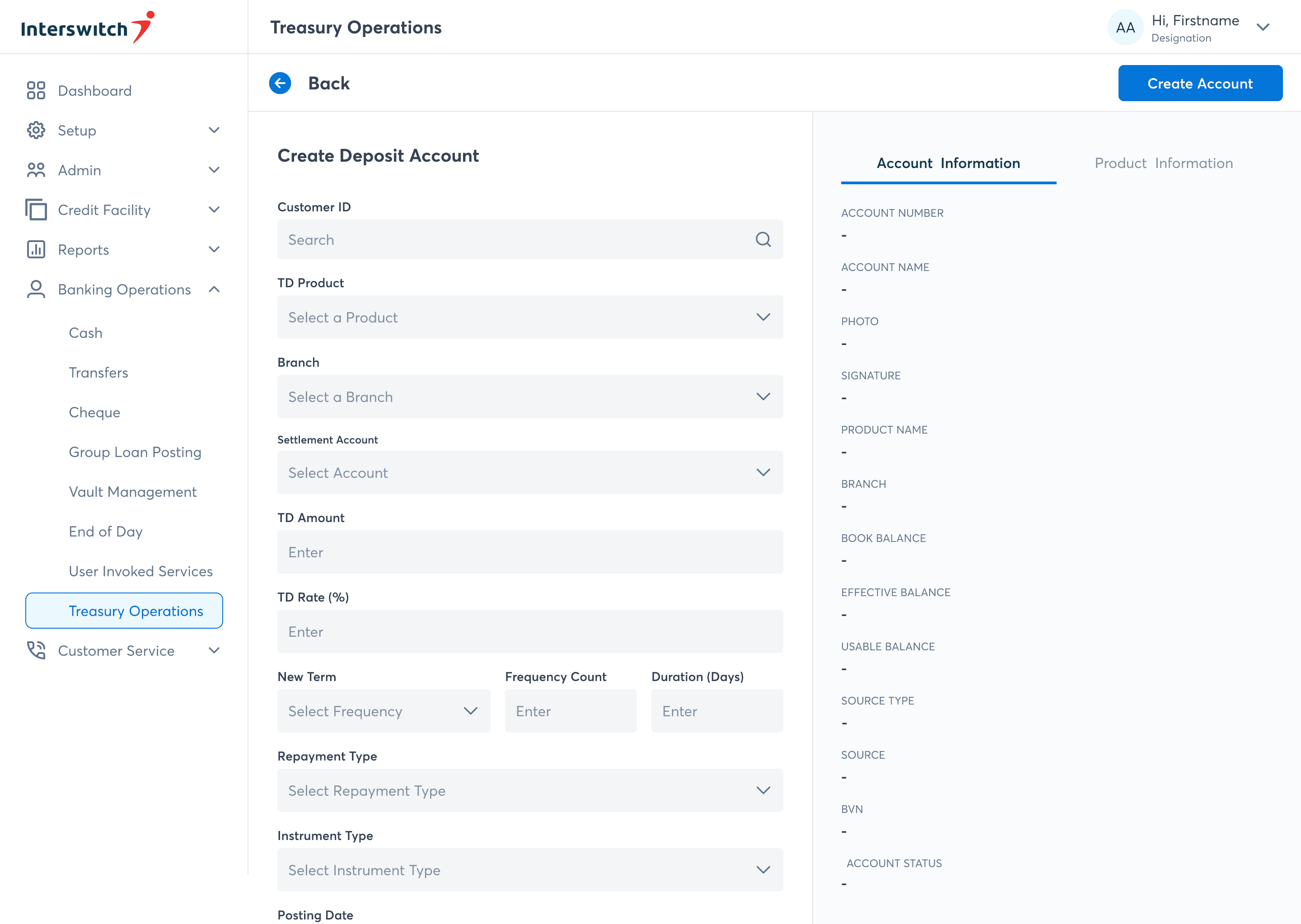

The established principles became the foundation for rethinking the platform's most frequently used experiences.
Bringing critical insights together
Users previously had to navigate between individual reports to understand operational performance. The redesigned overview brought key metrics into one place, making it easier to monitor business health, identify trends, and act on insights from a single view.

Helping users get it right the first time
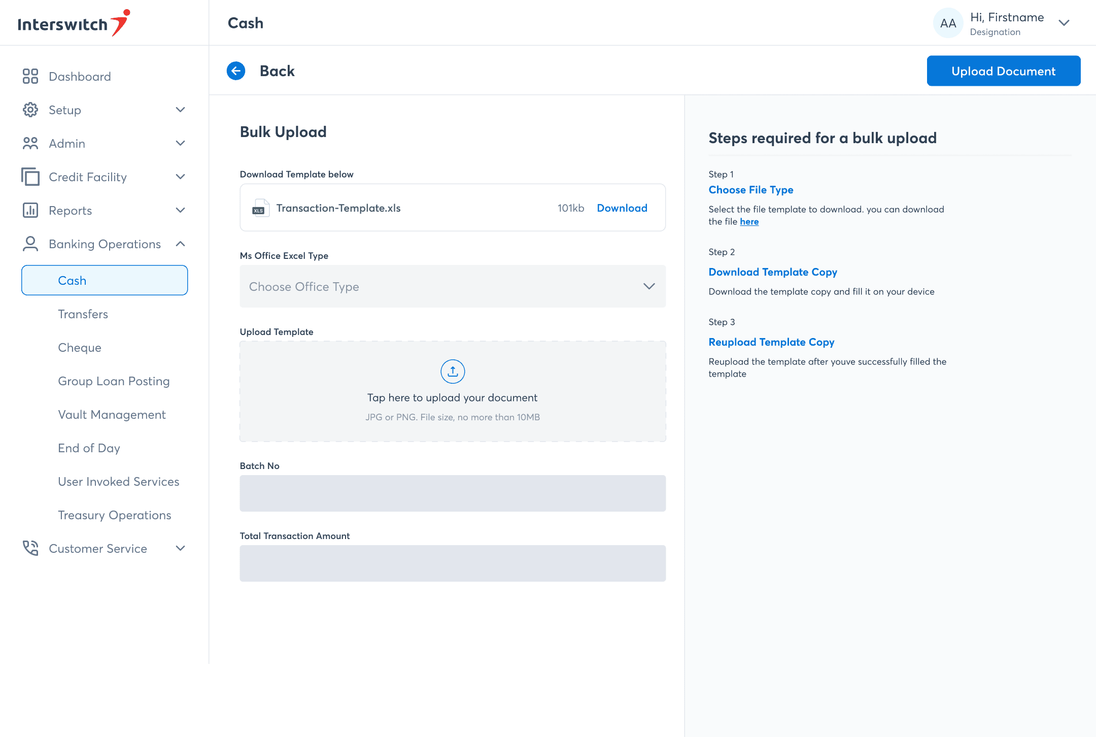
Some banking tasks were too complex to rely on memory alone. Contextual guidance was introduced at key moments to answer common questions, prevent avoidable mistakes, and help users complete unfamiliar workflows with confidence.
Keeping users in context
Users often needed additional account information while reviewing statements, but accessing those details shouldn't interrupt the task at hand. Secondary information was revealed within the same page, allowing users to explore more without breaking their workflow.


Making system feedback actionable
Bulk uploads could take time to process, leaving users unsure of what was happening or how to recover from failures. The redesigned experience surfaced each processing stage, clearly communicated errors, and provided downloadable reports so issues could be resolved without guesswork.


Guiding users from the start
The previous platform offered little guidance on where users should begin. The redesigned dashboard became a central starting point, surfacing priority actions, recent activity, and onboarding guidance to help users quickly understand what required their attention and what to do next.


The redesign established a stronger foundation for the platform's continued growth. Following its rollout, the platform supported the onboarding of 14 banks and expanded beyond Nigeria through deployment to a bank in Uganda, demonstrating its ability to support financial institutions across multiple markets.
This project taught me to zoom out before zooming in. Every screen mattered, but the real challenge was designing how the entire platform worked together. Once that became clear, many of the design decisions became clearer too.
<< Previous project
Next Project >>